Top 7 Website Design Mistakes That Are Killing Your Sales

Here are the Top 7 Website Design Mistakes That Are Killing Your Sales in 2026 (and exactly how to fix them).
These aren’t minor aesthetic issues — they’re conversion killers backed by real data. A single bad design choice can cause 7–53% of visitors to bounce instantly, directly slashing revenue.
1. Slow Loading Speed (The #1 Silent Killer)
Even a 1-second delay can reduce conversions by ~7%. Over 3 seconds? More than half of mobile visitors leave before the page finishes loading.
Why it kills sales: Visitors expect instant gratification. Slow sites feel unprofessional and unreliable.
Fix it: Compress images, enable browser caching, use a CDN, and eliminate heavy plugins. Aim for under 2 seconds load time (test with Google PageSpeed Insights).
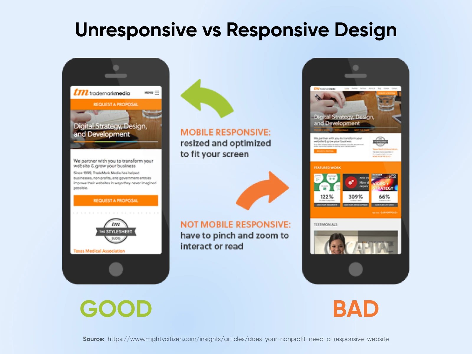
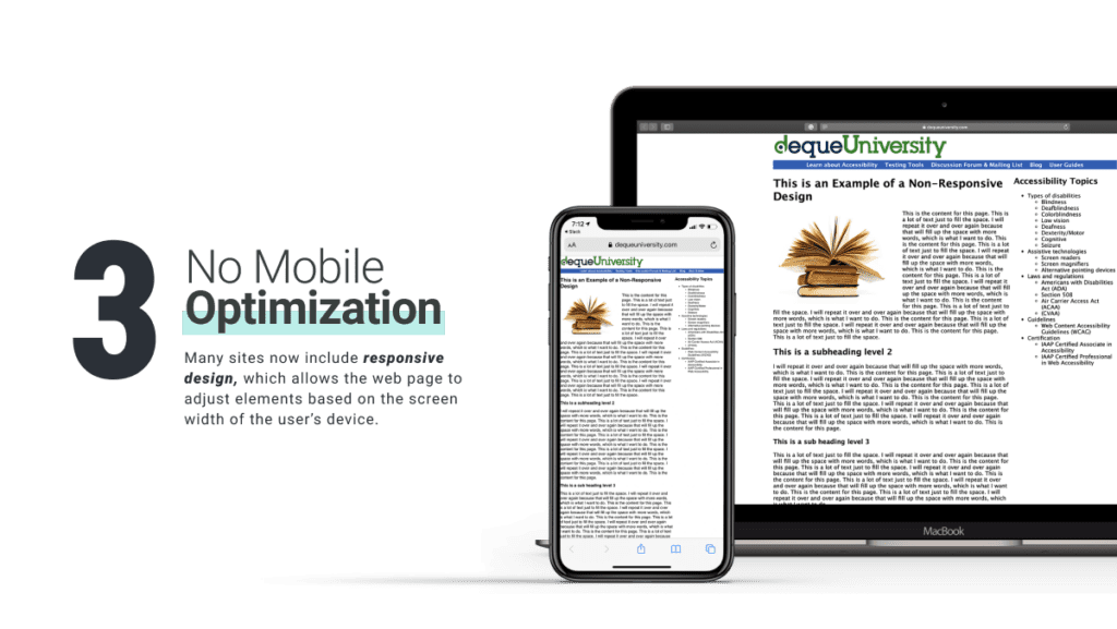
2. Poor Mobile Responsiveness (Ignoring the Majority of Traffic)
Over 60% of web traffic is now mobile. Non-responsive or “pinch-and-zoom” designs frustrate users and destroy trust.
Why it kills sales: Mobile users buy on impulse. If your site looks broken on their phone, they leave for a competitor.
Fix it: Adopt true mobile-first design. Test on real devices, use responsive frameworks, and make buttons/thumb-friendly.
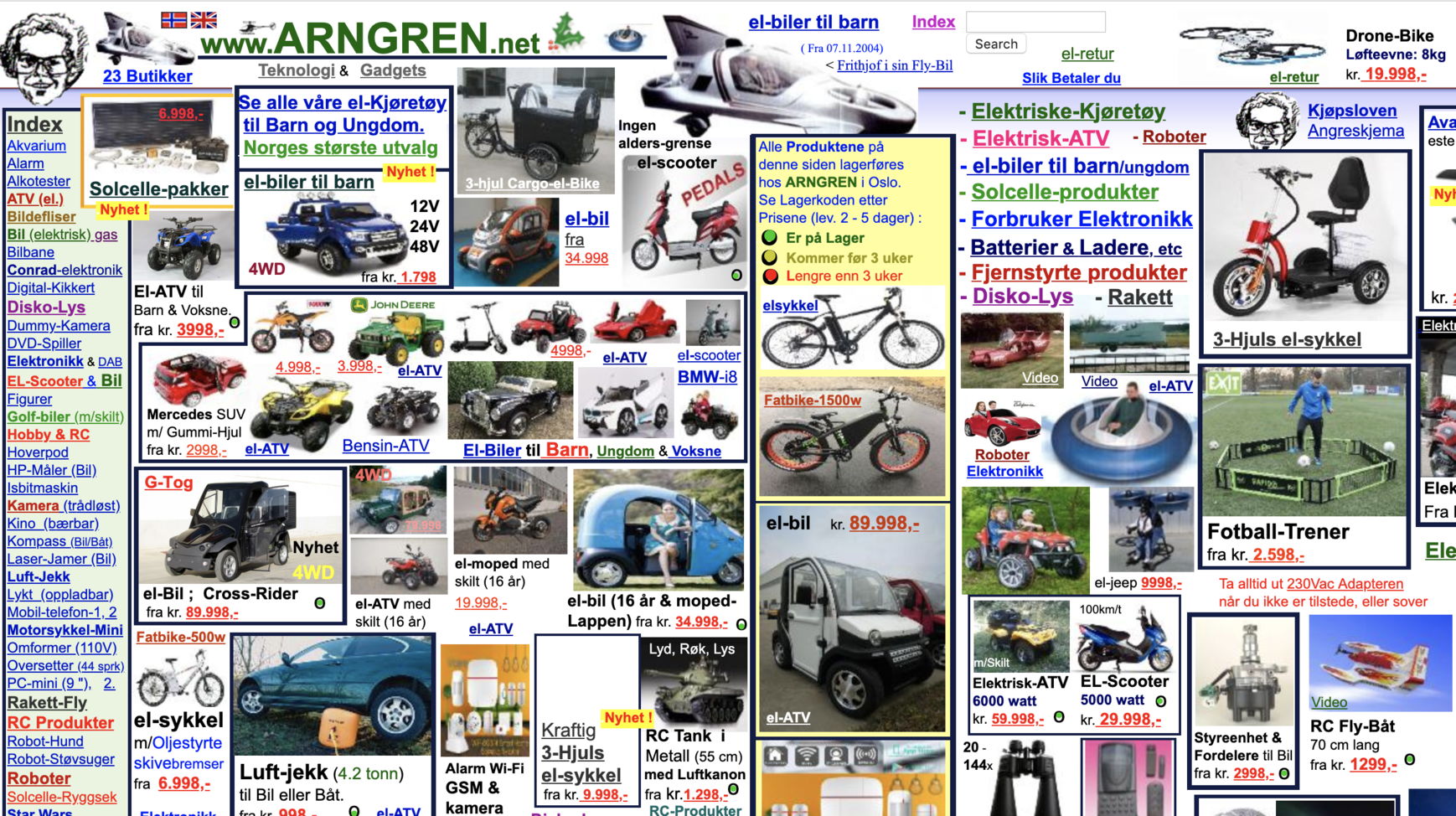
3. Cluttered Layouts & Confusing Navigation
Too many elements, competing headlines, flashing banners, or hidden menus create decision paralysis.
Why it kills sales: Users can’t find what they want in seconds → instant bounce.
Fix it: Embrace white space, simplify navigation to 5–7 top-level items, and use clear visual hierarchy (big headline → benefit → CTA).
4. Weak or Missing Calls-to-Action (CTAs)
Vague buttons like “Learn More,” “Submit,” or buried links leave visitors wondering what to do next.
Why it kills sales: Clear CTAs can boost conversions by up to 161%. Without them, traffic is wasted.
Fix it: Use action-oriented, benefit-driven text (“Get Your Free Quote” or “Start 14-Day Trial”). Make buttons large, high-contrast, and repeat them above the fold.


5. Poor Typography & Readability
Tiny fonts, low contrast, decorative typefaces, or walls of text make content impossible to read — especially on mobile.
Why it kills sales: If users can’t read your value proposition in 3–5 seconds, they leave.
Fix it: Use 16px+ body text, high contrast ratios (4.5:1 minimum), generous line spacing, and limit to 2–3 font families.
6. Generic Stock Images or Low-Quality Visuals
Overused, irrelevant stock photos scream “cheap” and fail to build emotional connection or trust.
Why it kills sales: 67% of shoppers say product images heavily influence purchases. Generic visuals kill credibility instantly.
Fix it: Replace with high-quality, original photography, custom illustrations, or authentic product shots. Show real people using your product.
7. Missing Trust Signals & Social Proof
No reviews, testimonials, security badges, client logos, or guarantees.
Why it kills sales: In 2026, trust is the #1 conversion factor online. Without it, even great designs fail.
Fix it: Place trust elements prominently (near CTAs and in footer): real customer reviews, “As seen in” logos, secure checkout badges, and money-back guarantees.
Quick Action Plan to Fix These Mistakes
Run a free audit with Google PageSpeed + Mobile-Friendly Test.
Ask 5 real customers to use your site while you watch (or use tools like Hotjar).
Prioritize the top 3 mistakes above — they deliver the fastest ROI.
Fixing even 2–3 of these can easily double your conversion rate.